The Final Cut Pro for iPad Review: Somewhere in Between
Final Cut Pro is an impressive feat of software engineering and tight hardware integration. A lot of editors will be very happy. A lot of others won't. Let us explain.
Jeff Greenberg • May 26, 2023
The TL;DR? Final Cut Pro for iPad is very capable and does a decent job of marrying the needs for touch and the benefits of the keyboard interface.
It's an entire shoot/edit/output machine in a single device―and way more functional than a phone. I can always connect a keyboard and/or mouse and use more than the one-finger touch interface a phone saddles you with.
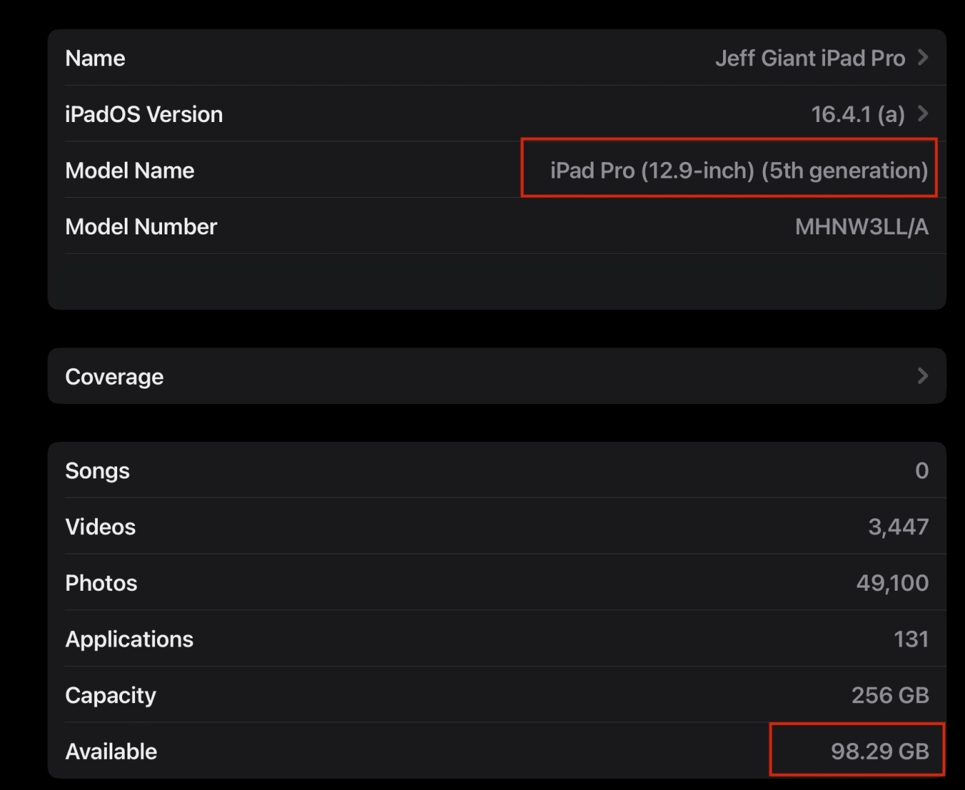
Hardware Requirement: You need to have an M1/2 iPad. A keyboard/trackpad/mouse will improve your experience. And while there is no external drive support yet―a Dock could be valuable if you want to connect peripherals to that iPad.
Generally: this is a great toolset. We'd be amazed at the functionality FCP for iPad provides without comparing it to the Desktop version. Like many Apple 1.0 releases, the software has ample places to grow―meaning it had me wanting more.
My Background and Expertise in Editing
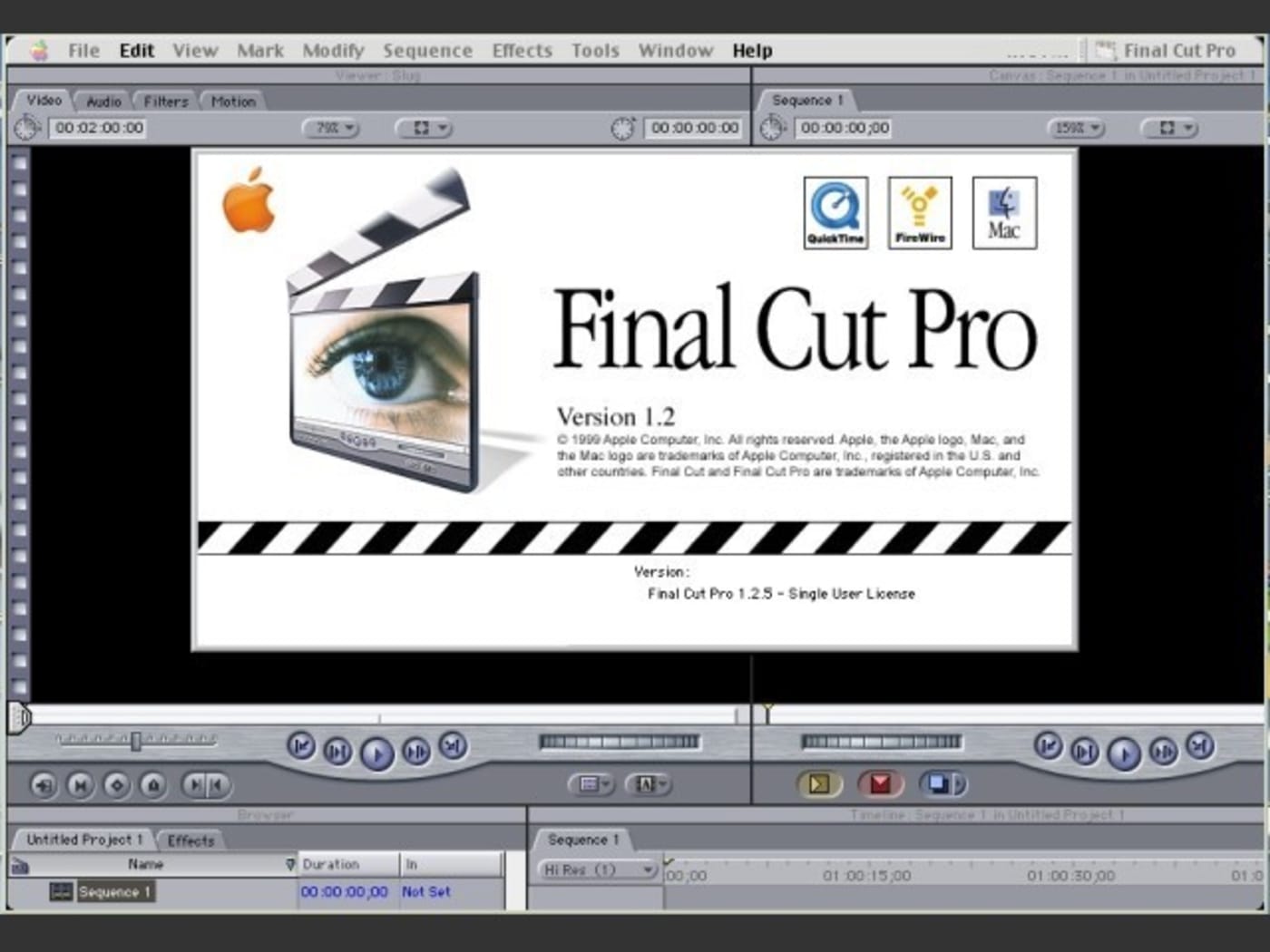
I've been editing since before the turn of the century. Make of that what you will. I have worked with various software tools, including FCP Classic starting at 1.2. I started with Final Cut Pro X on its release day.
I also have a history of doing quick analyses on new software releases. Back when FCPX 1.0 came out, I did a 3-hour tutorial on release week, back in the Stone Age (the days before Zoom.)
But, there are great overviews/training on FCP for iPad already out there
From Ripple Training (built in―part free and part paid) through the variety of great YouTubers ―people are scrambling to get the first videos and reviews out.
That's not this article.
Rather than knee-jerk reactions, I want to give you an in-depth picture of this 1.0 release, reflecting the good, medium, and a few misses.
I'm fully expecting that I'll get some of this totally wrong. This is the internet; the best way to get the right answer is to publish the wrong answer. I'm sure someone will correct me. (Cunningham's Law)
My approach to new tools
It's hard to not compare a new tool to existing or older tools. Especially when it shares the name of a Desktop tool.
No matter what, I always find some features to my liking, some great surprises, and often features that appeal to me less. This is expected.
Part of my process is understanding that "some things will be different." The best bet? Just accept it. I don't let my bias interfere with what the tool does. I have wishes for where they go, but I don't judge the tools based on that.
In this write-up, I aim to share my initial thoughts within the first two days of using Final Cut for iPad. And I'm treating it as a 1.0 release. I may not be the target audience, but I can internalize who they're supposed to be.
Who Final Cut Pro for iPad is great for: All-in-one Apple users
If you're an editor working primarily with iOS camera/mobile footage, this release is amazing on the iPad. For instance, I can only imagine how powerful this will be for schools. Even without tripods, lights, or microphones (but please get those things.)
You can do more than ever a full-fledged editorial tool on a sub $1,000 iPad.

Or this can be a great first tool for the FCP ecosystem. For instance grabbing a card full of footage and quickly putting together a rough cut of a scene all while on the set is possible with FCP for iPad. That is, except for one key issue: there is zero ability on day zero to edit from external storage. You have to import footage to the iPad itself for now.
I could see myself using it for dailies/quick initial edits with today's limitation that there's no real cloud sync infrastructure. You must go from FCP iPad to FCP Desktop on a one-way trip.
If you're shooting, LOG? Need to stabilize a few clips? The 1.0 release probably isn't going to be your jam. (LOG is there, it's just not pretty.)
My dream of starting in FCP (on Desktop or iPad), tossing a bunch of footage (like proxies!) on a cloud drive, working in FCP iPad, and having it just be available on Desktop? Sigh. Not today. No two-way street.
Difficulty in Design: A Blend of touch and keyboard
FCP for iPad represents a rethinking of the app in a big way. The whole interface and the workflows it funnels you into are optimized for touch. That's as it should be.
But touch is still a problem in some ways. This app allows you to do anything and everything you want with just your fingers. But that means using one finger for work where two or more are usually better. There's a reason that JKL exists for playback on every editorial tool.
JKL allow you to use your keyboard to make fine, frame-by-frame adjustments on your timeline. To their credit, Apple knew the loss of the keyboard could be an issue for such adjustments, so FCP for iPad introduces the jog wheel interface element. It works well and it's repositionable―left or right side of the screen. I've tried both sides and find it works well.

Despite being right-hand dominant, there are times on a standard keyboard when I use my right hand on the navigation keys and sometimes my left hand.
I find it exactly the same here with the jog wheel. I loved moving the jog wheel to the left side of the screen and using the trim head or trim tail feature with my right hand.
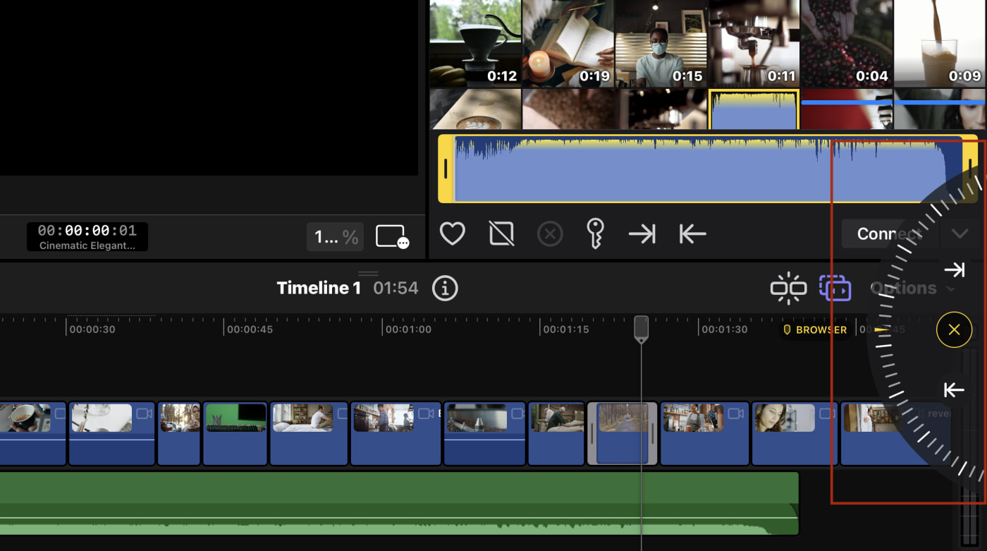
However, the jog wheel did get me thinking: I've never wanted haptics so badly on an iPad. Haptics like those found on the iPhone would really give you a tactile feel when using the jog wheel or when scrubbing across clips and the timeline itself.
Editing is slightly changed because of touch
As intuitive as the jog wheel is, there is a short learning curve in that the jog wheel functionality is set to a selection. You must select a clip to edit―or make sure there's no selection. There's no way for the interface to know where you're looking (as compared to when you use a mouse/pointer on Desktop).
It took my brain a minute to learn IN at the top/OUT at the bottom for source clips. I kept picking the wrong one.
Clip, range, or edge?
This is more about my assumptions about how editing should work. It took a couple of tries to understand several features.
The default is Clip mode, and yes, I'm using the word mode. (Don't get me started with the difference between modal and non-modal toolsets. Nobody really cares except me and some UI people.)
Select a clip on the timeline and the entire clip is adjustable, including trimming the clip.
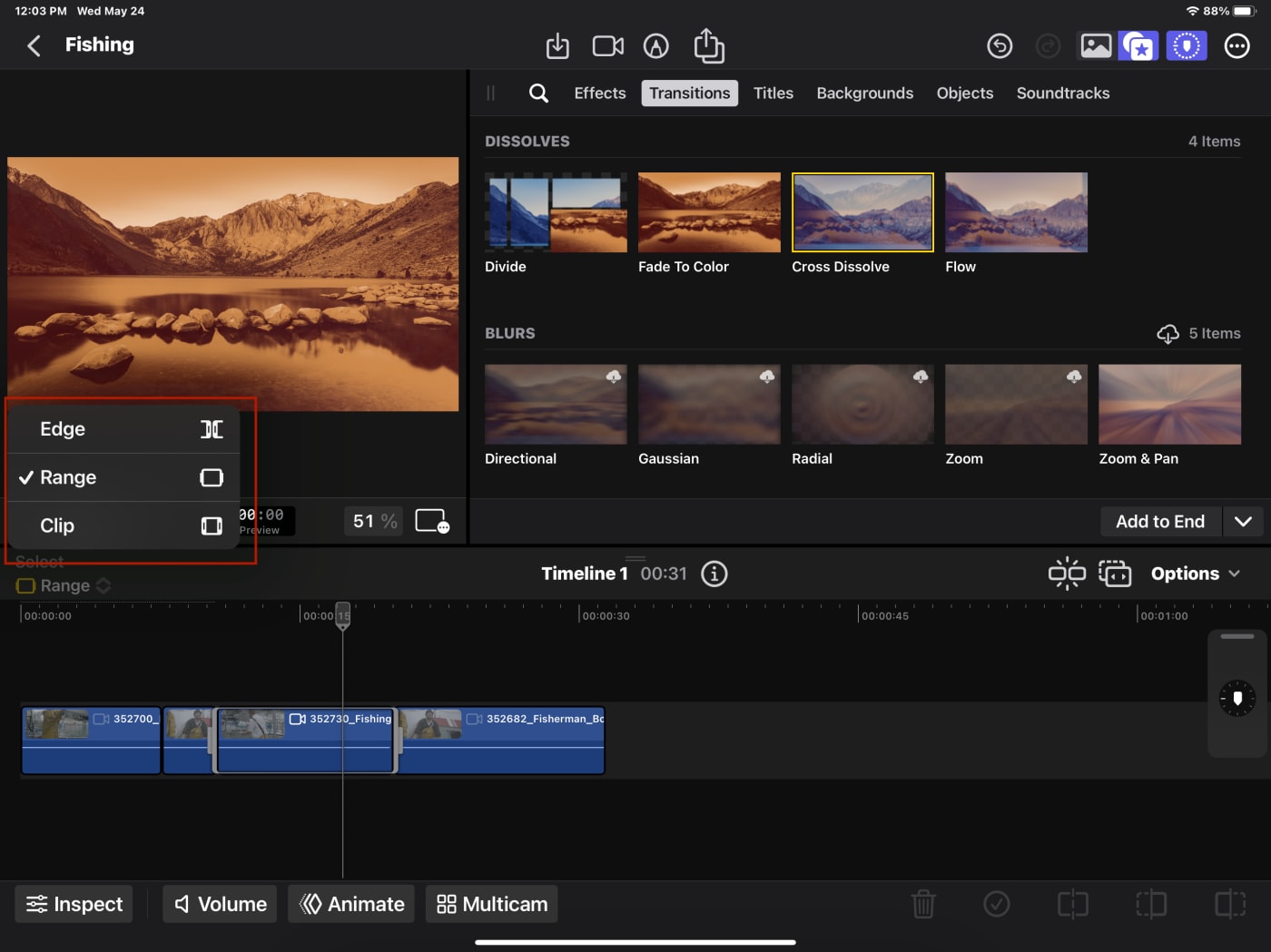
To select multiple clips to add an effect or transition, you'll want to use Range mode. However, this implementation of Range mode failed me when I went to animate keyframes for audio―one of my favorite uses of the Range feature on Desktop.
Edge mode―which is not trim mode―kills me a tad. I get it's meant for dynamic selections of edit points (the space between edits), and the magnetic timeline makes trimming much more seamless. I think the major usage of edge mode is to do roll edits.
What kills me about these modes? There's no way to change them from the keyboard. And these keys do something on Desktop!
Position, meanwhile, is not grouped with the rest of the features. The toggling of the Position switch allows you to move elements and leave gaps as needed. It's both a button on the toolbar and under the options drop-down.
What about the keyboard?
Yes, FCP for iPad is totally functional as a touch-only app, but honestly, even on the iPad the app feels much better when used with a keyboard. Those of you who are very Final Cut keyboard-centric, should acclimate fairly quickly but be warned: only some keyboard commands are here and they're not customizable.
I am missing so many keys and, in that respect, their functionality as well. There's no ability to remove an effect from multiple clips at once, or turn off the view (visibility) of a specific clip or solo footage.
Working without being able to solo audio makes things a little frustrating when you're trying to adjust someone's voice with music in the background.
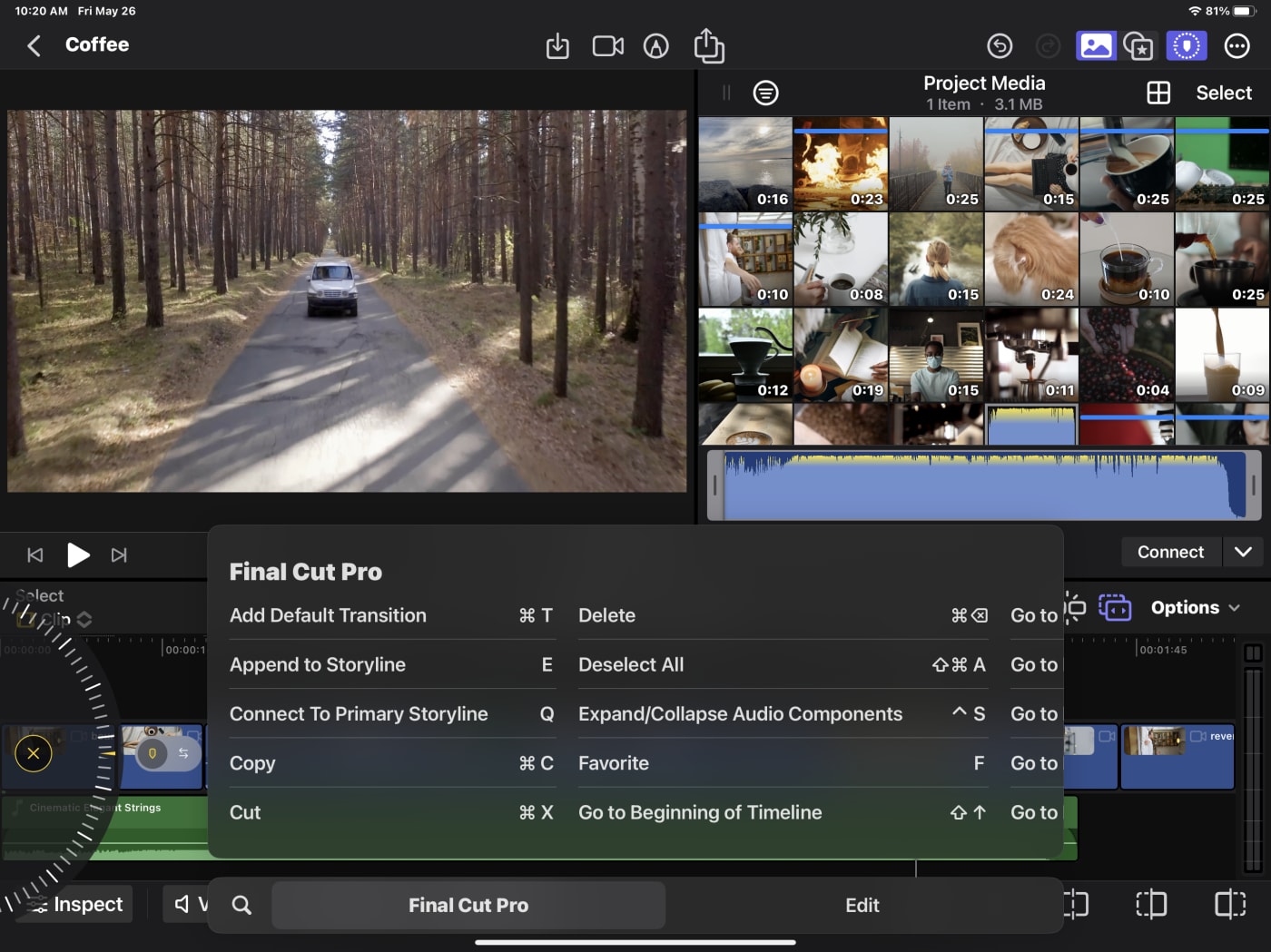
Let's switch to the positive: There's a hidden iPad trick, hold down the command key, and you get the available keyboard shortcuts.
Getting files in is limited
I've never heavily dealt with iOS file management. A walled garden has generally made sense to me. I love the idea that we are protecting users from malicious software.
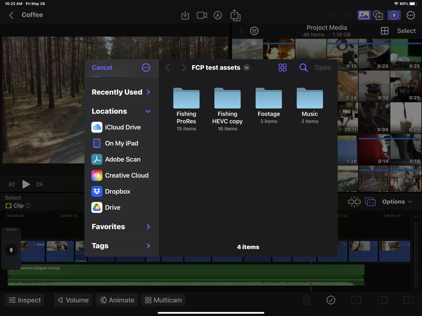
But everything has to live on the iPad. That's right, the Day 1 limitation: no editing from external media. I'm told this will change.
So much for my OWC Envoy drive full of footage.
I tried AirDropping, and it was mediocre. While I use AirDrop often, it failed multiple times with an 8GB set of ProRes files.
I had to import all of my footage to the iPad's internal storage via a direct connection from a drive.
Would a dock work? YES!
I use my iPad Pro for many things, none of which is a desktop replacement. But some people do. I love the allure of a super thin iPad connected to my system, pulling one cable and having the same sleek surface to go with me.
So, why not plug in a dock?
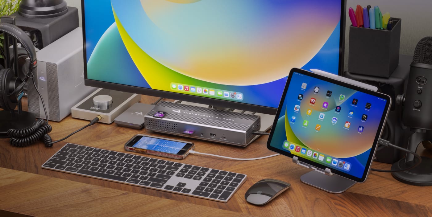
The iPad has a single USB-C port, so I plugged my OWC Travel dock into it, grabbed an HDMI cable, and whoa―I could immediately see how it's nearly a full desktop replacement.
Starting with the M1-equipped models―that's the 3rd generation iPad Pro 11-inch and the 5th generation iPad Pro 12.9-inch―the iPad Pro also supports Thunderbolt connections. So, my OWC Thunderbolt 3 dock worked perfectly. Suddenly, I could access…well, everything. My mechanical keyboard, a mouse, and more media. Too bad my Stream Deck couldn't do anything.
I did have one realization: I am scared of ejecting disks on an iPad. I'm told that write/caching isn't used by iOS. It just felt unsafe to eject without some visible confirmation that it was safe to do so.
Not all of my media worked
On this initial release vVideo format support is as follows
- ProRes
- ProRes RAW
- H.264
- HEVC
- MXF (ProRes)
That's fine for 1.0 as that's everything that an iOS or iPadOS device can create.
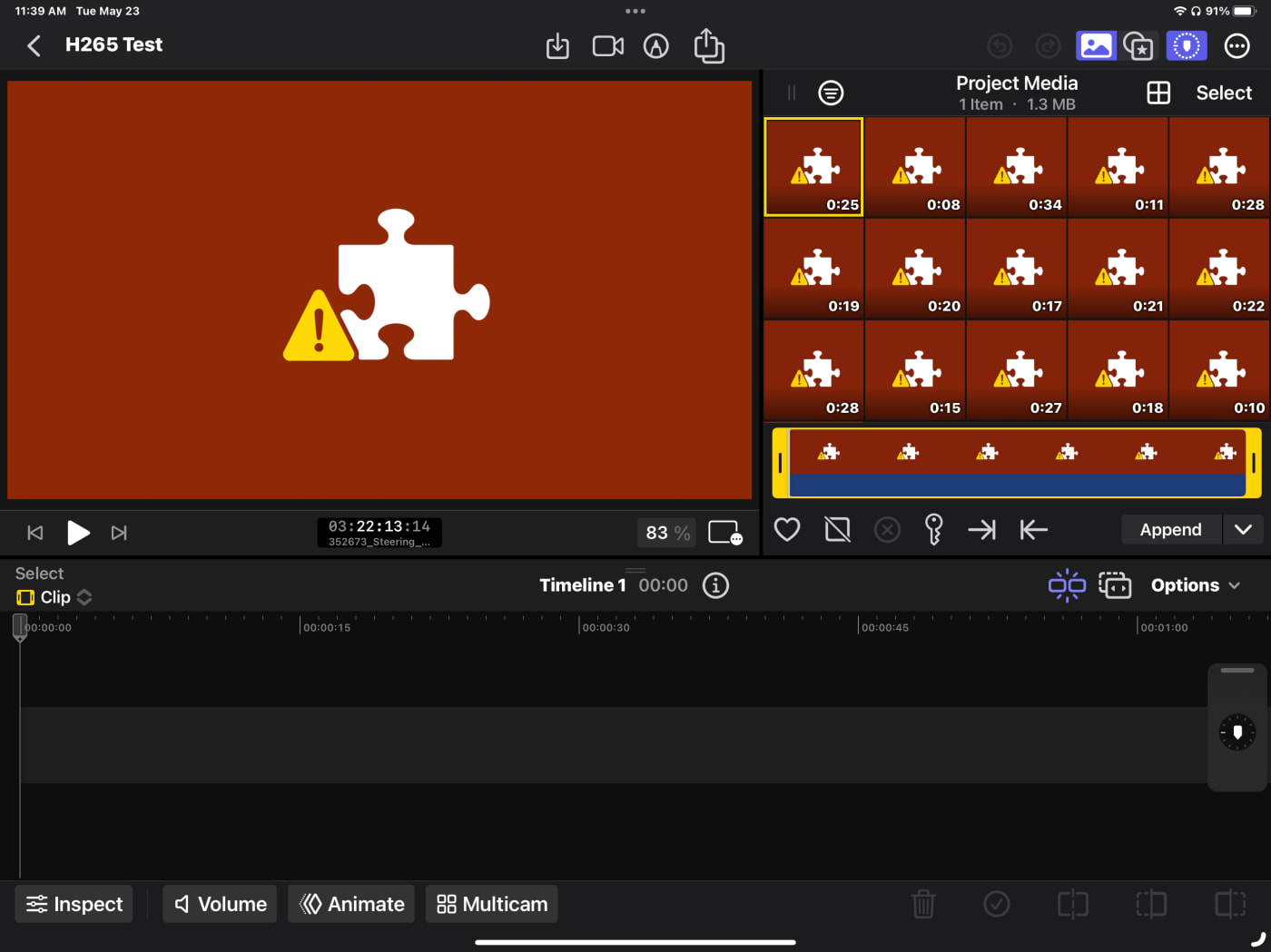
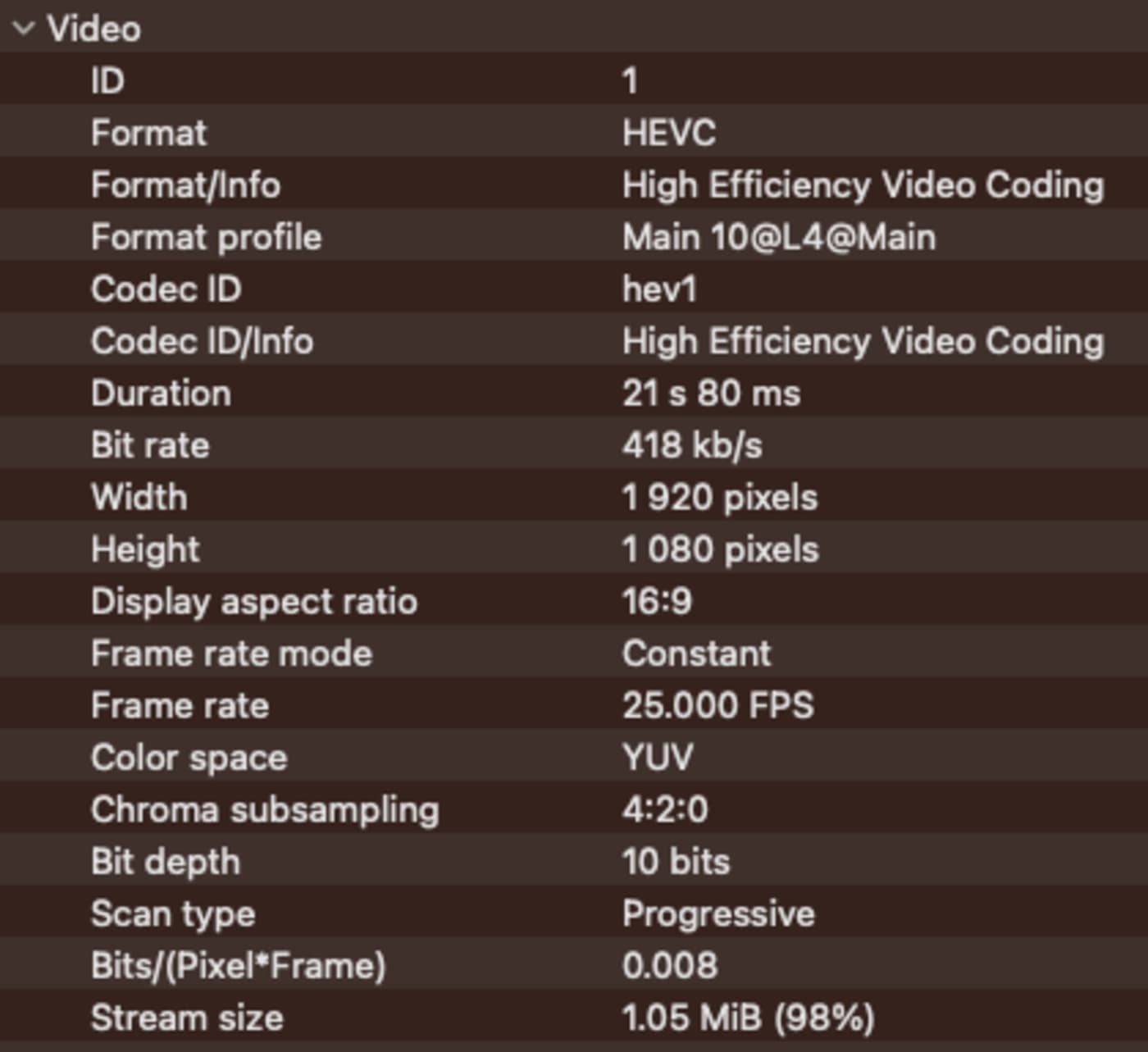
Except, at the very least, I got it to fail. I built some very compressed, but good-looking HEVC video―we're talking 4k that hits 15MB a minute.
For those of you who care?
The iPad doesn't like it at all. Another software tool that will remain nameless does play/edit it on the same iPad.
Likely, I broke the specific hardware compatibility with my compression settings. Those clips don't play via Quicklook or Quicktime on my Mac, so it was likely outside of spec.
LOG footage limitations
Right now, FCP for iPad does not support the ability to add custom LUTs. It does let you apply built-in LUTs from the major camera makers out there like Sony, Canon, Arri, and Blackmagic. However, there are some camera manufacturers missing from what's built-in: Fujifilm for example.
And some will argue this, but there isn't a robust color management solution in place yet, either.
Instead, they have improved workflows for handling LOG and HDR footage.
Apple recognizes the importance of mixing in HDR footage-given that the day the iPhone 12 Pro came out, it became the top HDR-capable camera based solely on phones sold. So it had to work from their own hardware. Their new method is smart and invisible―how Apple should make things.
But less-so with LOG footage.
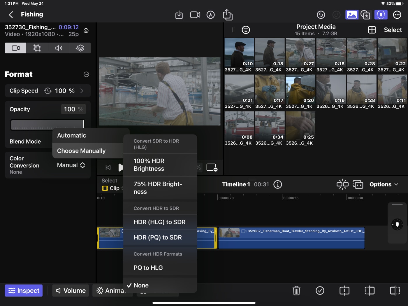
If the footage comes from metadata that Apple is aware of, it automatically applies the correct adjustment.
When the footage isn't recognized, you can assign it a Log Processing choice, but only in the Project media. This mirrors the way the Desktop version works.
- Can you select multiple clips and set the LOG preference? No.
- Can you change a clip on the timeline that needs LOG handling and fix it on the timeline? No.
- LOG has to be applied on the source, and there's no Match Frame (find the source clip)
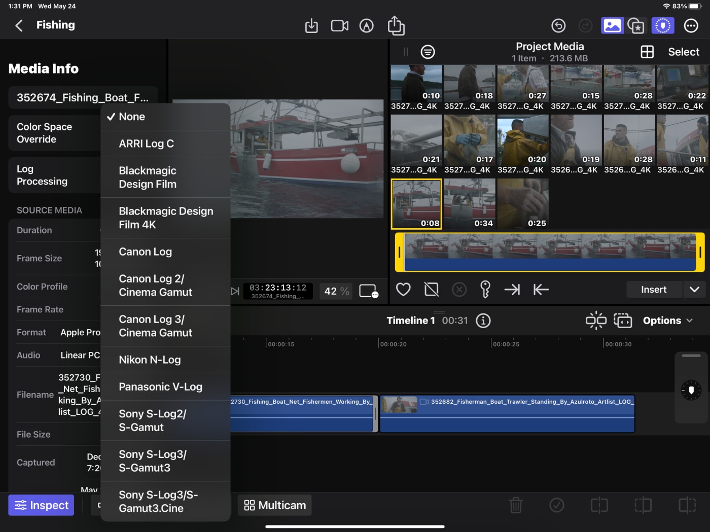
This is a source-side LUT―and there aren't any real timeline-based LUTs at this time.
New features
Ok, there are two heavily mentioned new features. Live Drawing―because it's an iPad. A finger, pencil, or stylus works here. The other? AI has been moving aggressively, and Scene Removal is an AI-based feature.
Live Drawing
Getting started with this new feature, it's super easy to circle/append notes.
It could be great for sports or other live events (a telestrator for example.) I love that it can be easily animated and adjusted.
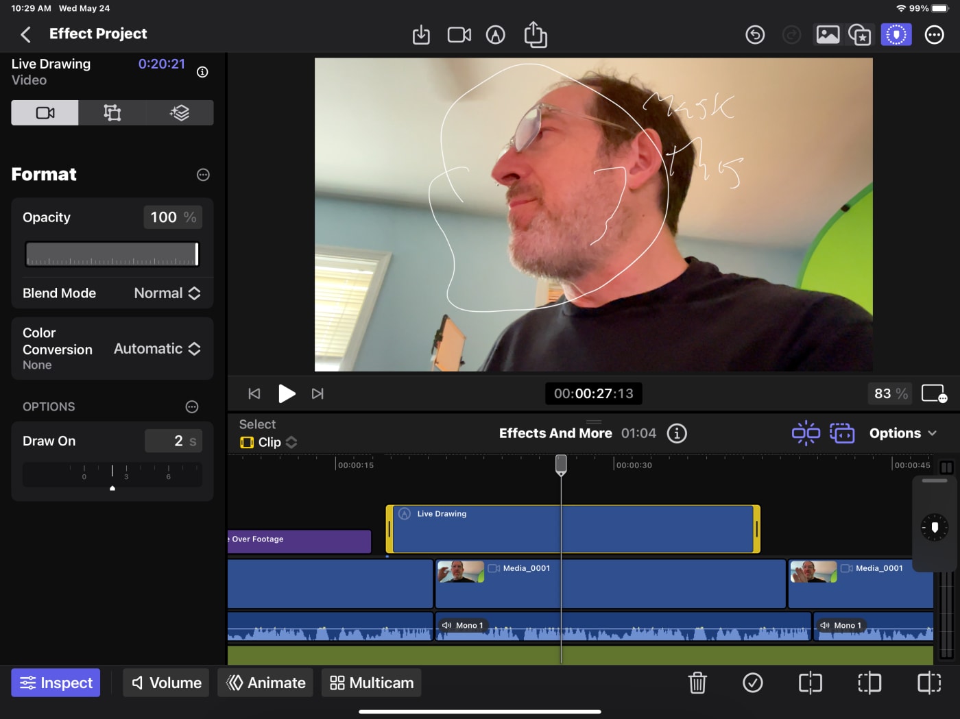
The Live Drawing feature could also be useful for educational or training videos, allowing the presenter to annotate and highlight key points as they go along.
I'd like it even more if I could attach it via tracking to something in the frame.
Scene Removal
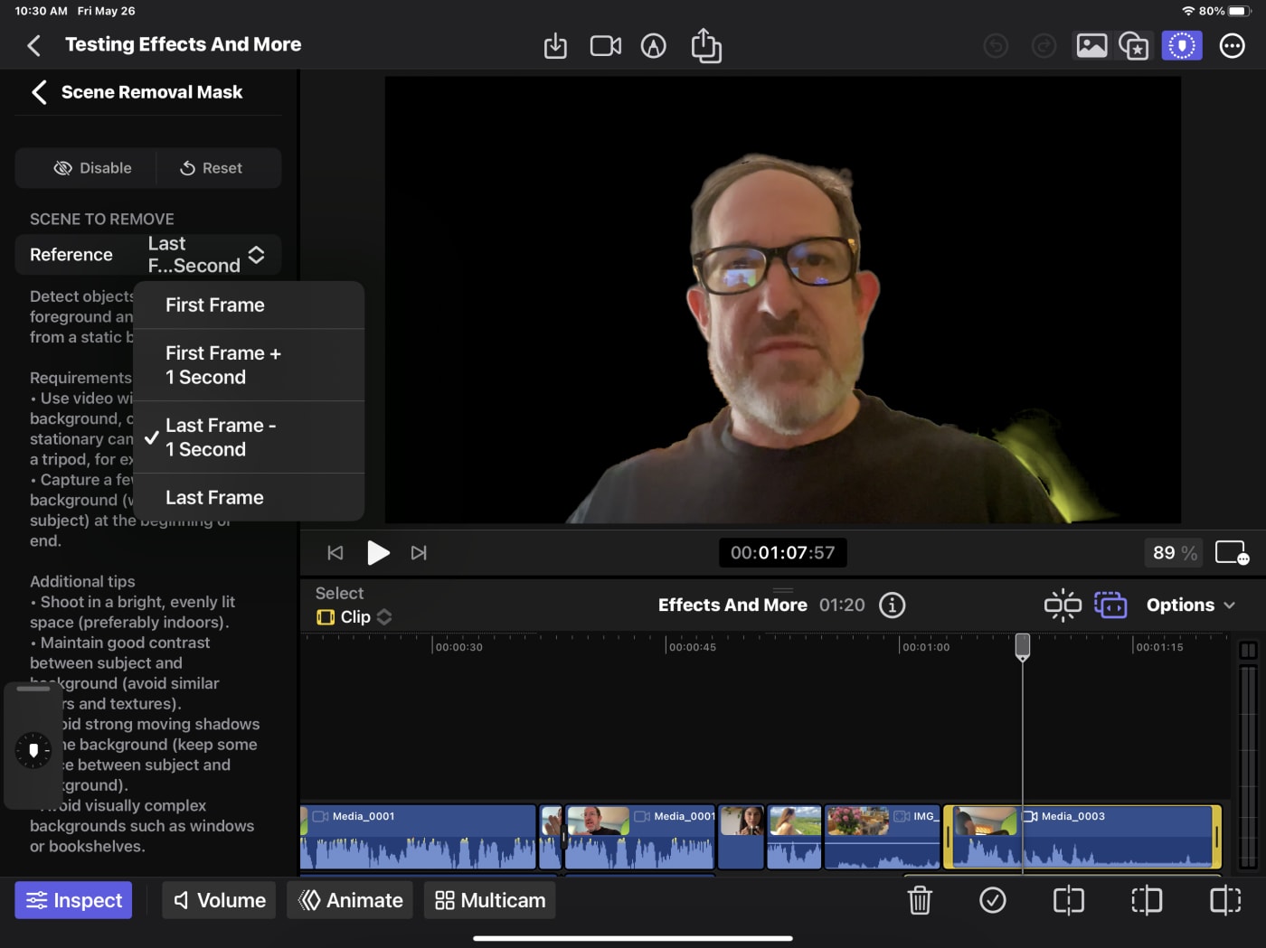
Probably could have used a better name with this one. Maybe Video Background Remover? And while they mention "under the right circumstances" in all the materials, few people I've seen in YouTube reviews have been able to nail it. Most people won't hit the checkboxes to make it work well.
We all want the dream of "magic" background removal from our subject. AI can sorta do this. It does it well on stills, but less well on moving video (because of edges.)
Suggested steps:
- Shoot stable, preferably with a tripod or gimbal.
- Have the subject off-camera at the beginning or end.
There's a clever set of choices that Apple has appended to this feature: for instance, first/last frame minus a second for you to get on/off-screen.
I really wanted this to work perfectly, but ultimately, it's not great. In my tests I got flickering, with so-so edges.
I'm 100% sure it needs to be "well exposed," and I didn't do it well enough. Or at least the front camera on the iPad Pro won't.
Interesting discoveries
Here is a bucket of items that are in my notes of interest.
More than one timeline?
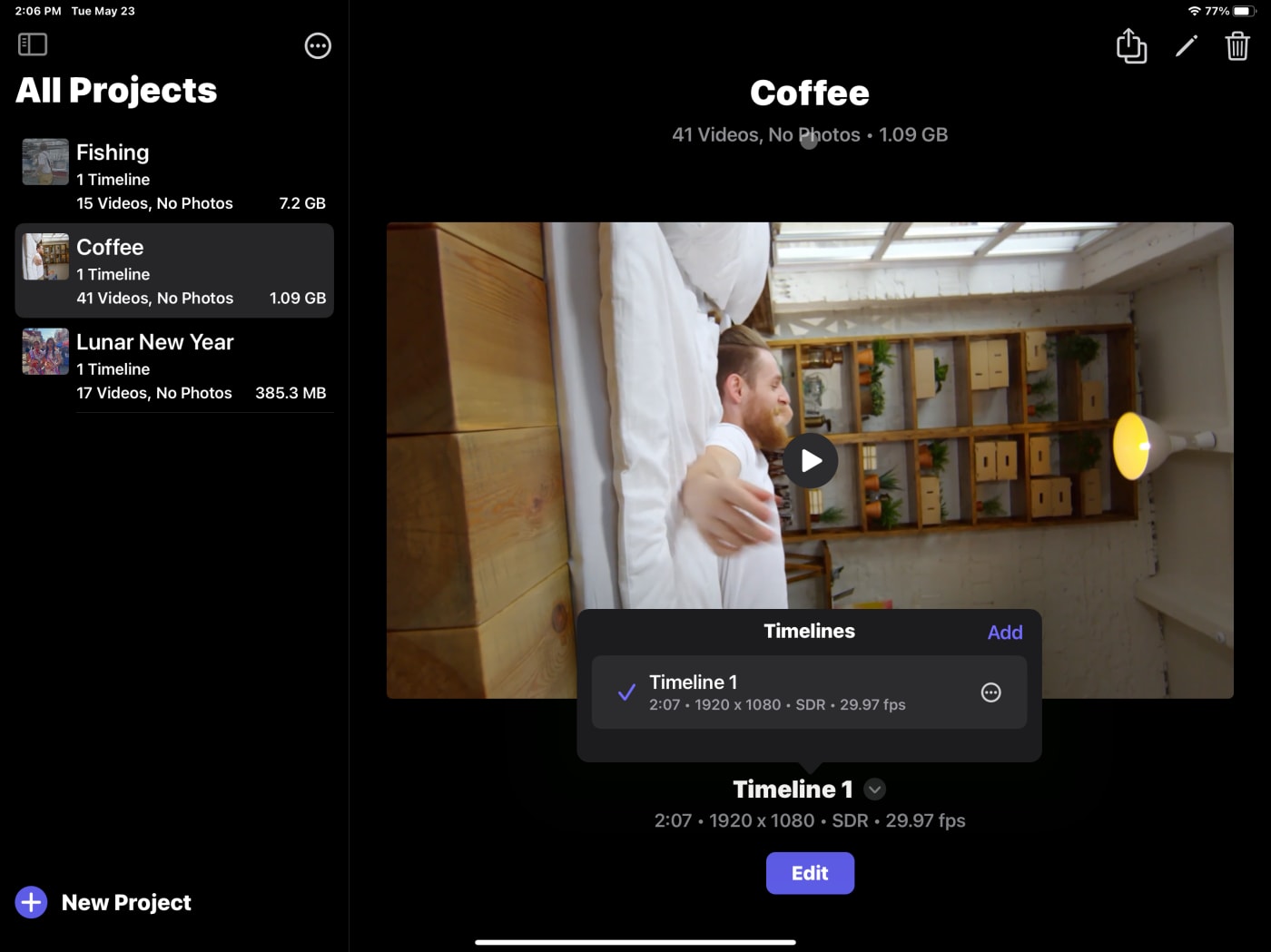
Editing is about iteration. And versions. Especially when there's all that reformatting for social media. To get another version of your timeline, you must go back to the Project level and duplicate the timeline there.
There is no Library
Unlike FCP for the Mac, your assets are not stored in a Library. FCP for iPad now calls this a Project. And Timelines are in the Project. And that naming convention? It's not on the Desktop version yet. It's still Library (which is a project on the iPad), Project (which is a Timeline on the iPad), and Events (and there are no events on the iPad.)
Split edits
Roll edits―where both sides of an edit roll―were easy. Ripple editing is part of the magic of the magnetic timeline.
To me, a sign of strong editorial technique is creating split edits, points where the video and audio cuts are at different moments.
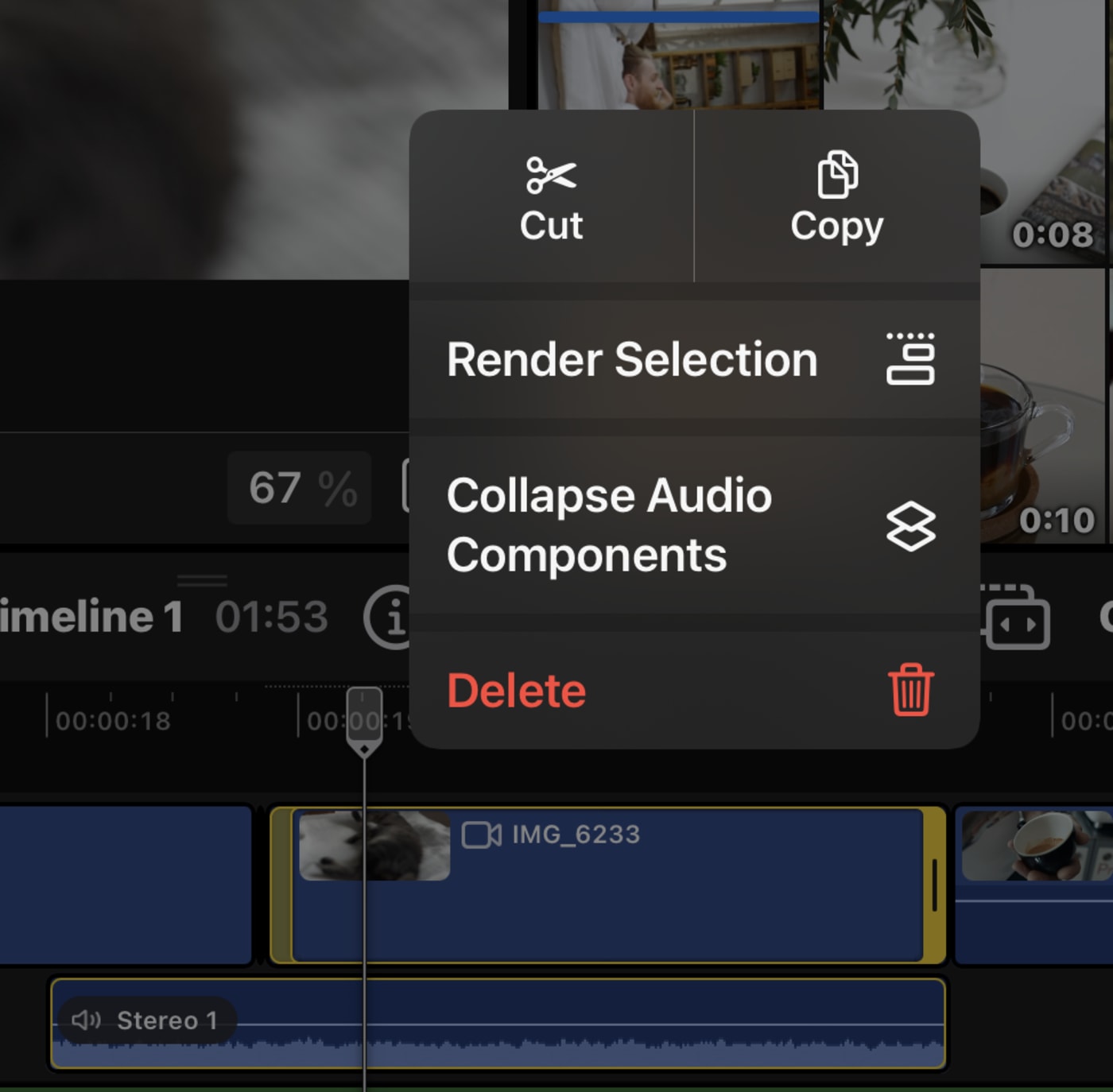
To get to this, I had to: Expand the Audio components and trim the video only.
- To expand one clip, use a long press.
- From the keyboard? Control S
- The Options menu can do this for every clip simultaneously on a timeline. This is very useful for trimming up a longer piece.
Audio scrubbing
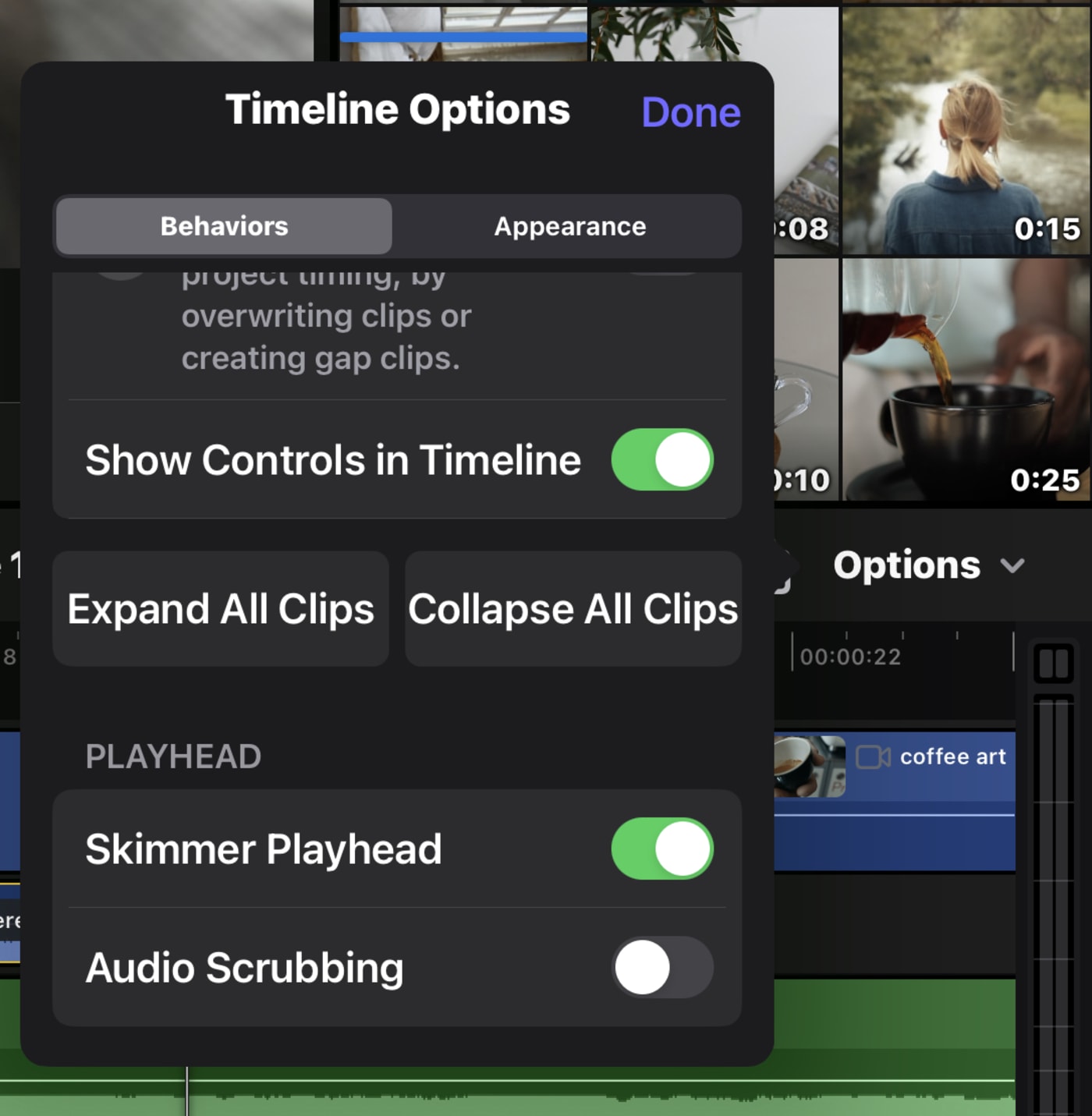
Most of the time, I'm not too fond of audio scrubbing. I find it distracting. It's available in the Timeline options, but you have to know to scroll downwards.
Exporting projects to a Mac
Nearly the first thing I did was export the project to my Mac, which worked great. It's an FCPproj extension, a bundle with the media inside it. In fact, upon opening it up, you'll find it has a unique UUID and a Final Cut Library file.

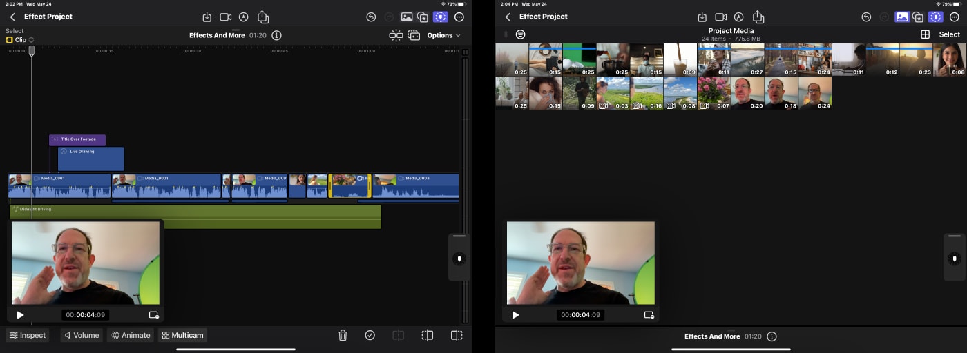
PIP is fantastic a fantastic view.
If you talk to any editor and ask them about a PIP effect, they will think that you mean a Picture in Picture effect. That's not what this is.
The Picture in Picture view gives you a window you can move around―and here's the key point―making the rest of the screen available for working with the timeline, looking at clips in the project or effects. It's a great use of the limited iPad real estate, especially if you're opting to go the touch-only route.
Animation
One of FCP's (Desktop) weaker features is keyframing. I was very curious about how they'd handle it on the iPad.
I think I see how this is meant to work―you'd pick a feature such as Position or Opacity, add a keyframe, move later, and adjust.
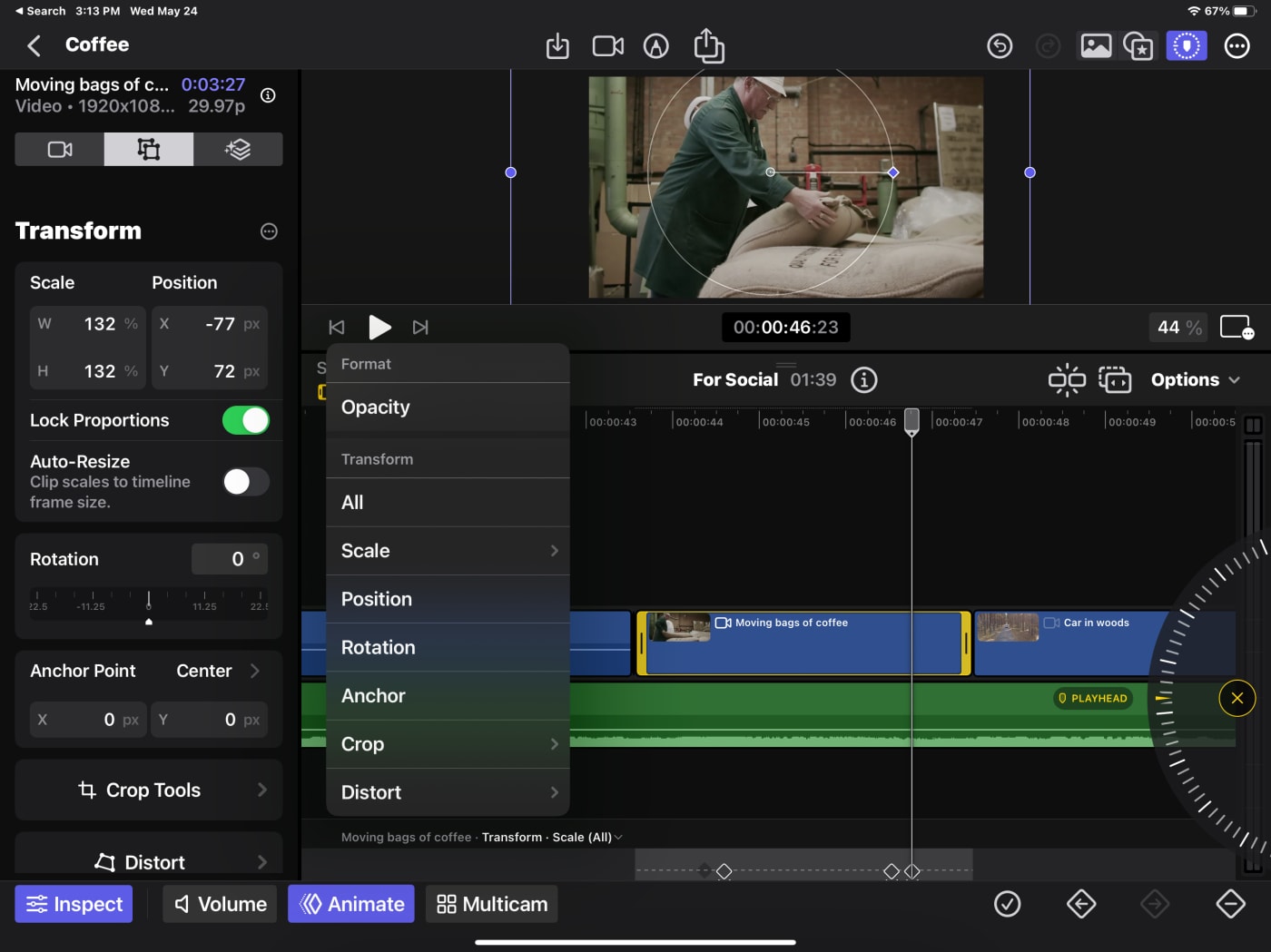
But I encountered a problem trying a common animation: changing the Scale and Position separately. I animated Position, then Scale… but somehow, I created an extra keyframe. I could remove the additional keyframe for just Scale, but it reset both the Position and Scale parameters. I couldn't access just one or just the other.
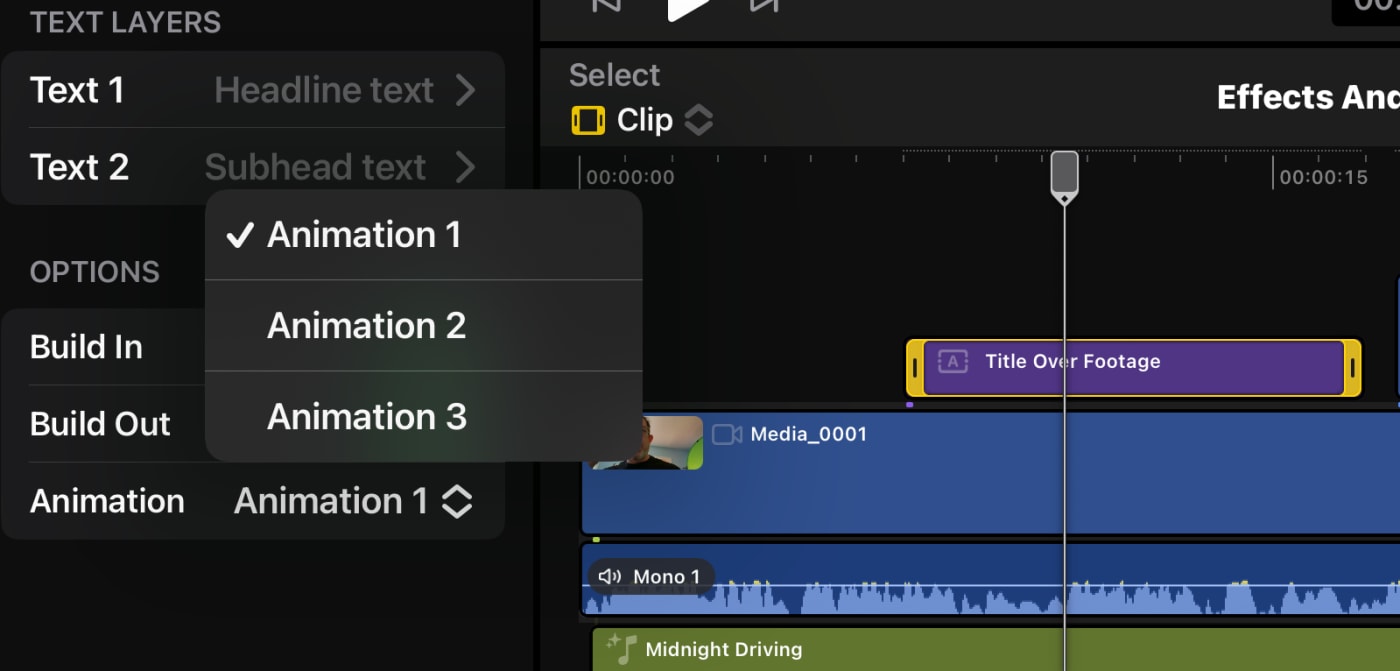
Apple clearly designed some new animation settings. The text and titles have built-in animations. Something needs to be added here: many basic parameters could and should have fast presets. Or a behavior system like Motion.
Audio effects
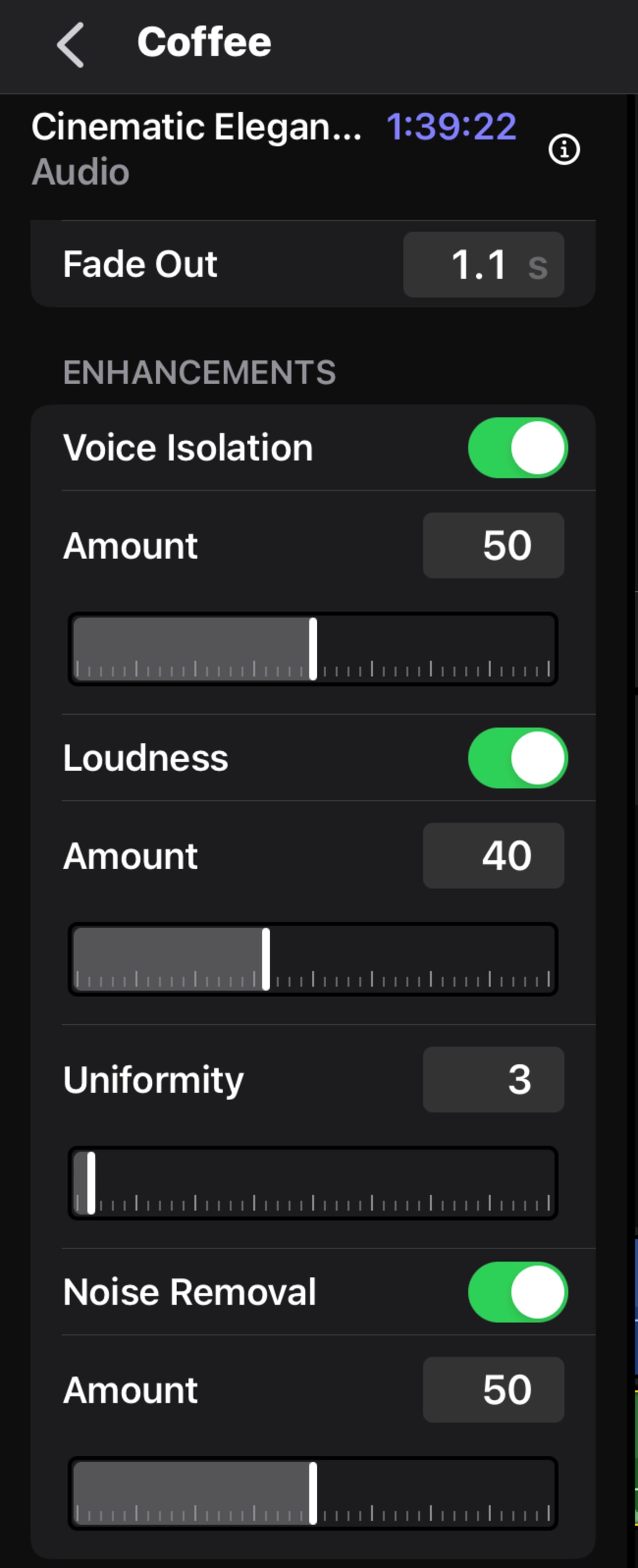
The most important audio effects aren't effects, they're Enhancements. Their immediate accessibility is fantastic:
- Voice isolation - probably the most useful new feature, especially extracting voices taken with the iPhone built-in microphones
- Noise Removal - combined with voice isolation is a great combination.
- Loudness - a well-designed "leveler" for voices
All the other audio effects are elements you add from the effects area. And they have the same flaw―and it's glaring to me. A need for the ability to solo elements.
Soundtracks
If you think this is a stock music stop, this is something totally different.
The soundtracks seem to be dynamically shortening/extending music samples. The idea is to save you laboring over editing an audio file to ensure that the beat or a certain sound line up perfectly with something happening in your video clip. The software just handles it for you.
I haven't dug deep into this, but this is an outstanding feature. I hope to see more of these. There are under 40 soundtracks here, and they will get overused quickly.
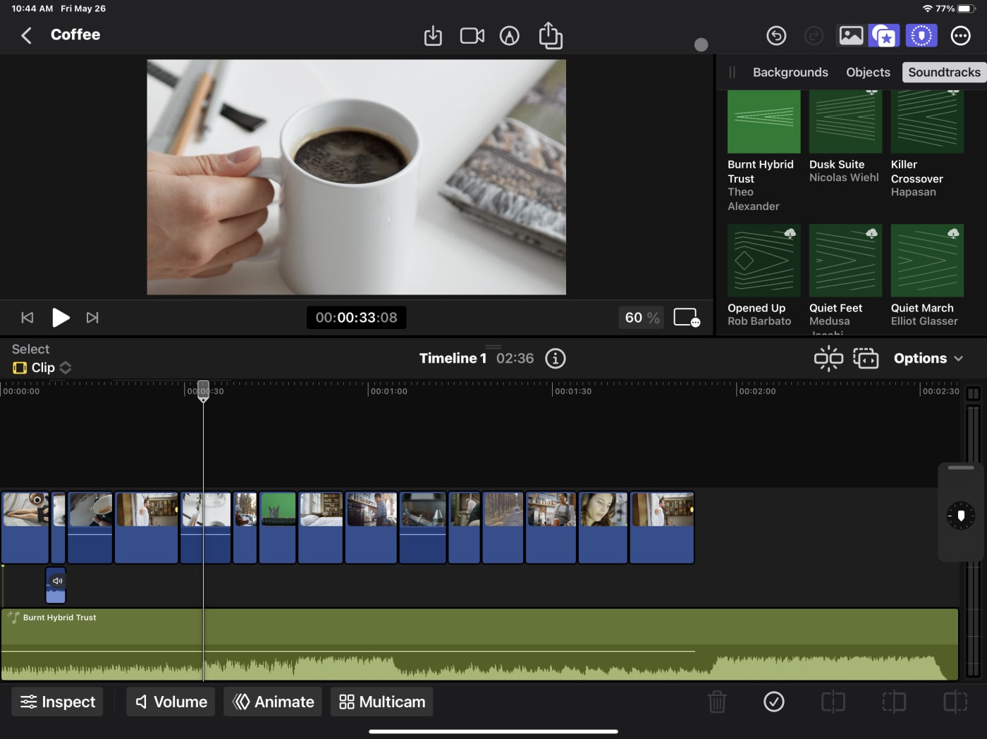
I'm curious to know if these are looped midi items that can be created with Logic Pro. That's a missing item since the days of SoundTrack Pro. Although, I met very few people who ever built a music soundbed in SoundTrack Pro totally from scratch. Apple never created 30 or so templates way back then. This may be something new.

What role do Roles have?
I'm a fan of Roles: media in Final Cut Pro that has a wider classification or grouping. They have potential that still hasn't been realized. Some elements know their role on import. When I bring in a music clip (stereo, mixed to 0DB), it's not automatically recognized in FCP for iPad―and yes, it should be on both Desktop and iPad.
Apple has the ability to recognize, in many cases, what music is, what dialog is, and what is FX (or ambiance)
The same person who relies on Apple's voice isolation from their iPhone's microphone likely could use a feature where Final Cut performs a semi-automatic mix based on the Roles.
But for the present? I'm not sure what Roles do here beyond providing some clip color.
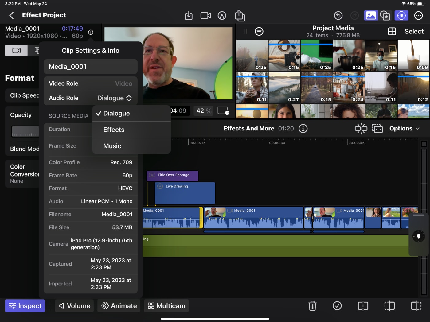
The Inspector is on the left?
This feels like a UI break. On the Desktop version, the Browser is on the left, and the Inspector is on the right. Here on the iPad, it's the reverse.
I don't have any real insight into why; I find it curious. I could see the direction of putting the jog wheel on the right, wanting to put the media/effects in the upper right, and the Inspector going to the left because it's the only space left.
There certainly is the overarching issue of a lack of space on an iPad (and I'm using the 12.9" one.)
Built-in camera lacks Cinematic Mode
I don't have much to say about using the camera inside FCP for iPad.
There are a couple of smart overlays, including a square grid (for social) and a zebra striping for overexposure.
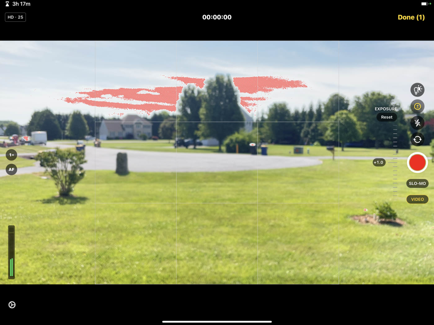
But, my iPad Pro 12.9, 5th gen, doesn't allow you to shoot video in Cinematic Mode. Which led me down a rabbit hole. Why doesn't a $1k iPad have this?
Turns out, shooting in Cinematic Mode its an iPhone-only feature for now. As of this writing, only the iPhone 13 and 14 models can shoot in Cinematic Mode, though you can edit Cinematic Mode footage on the iPad.
Hopefully Apple brings this feature to the iPad Pro at some point. It would certainly allow you to get the most out of FCP for iPad's built-in camera mode.
Project Media (Browser)
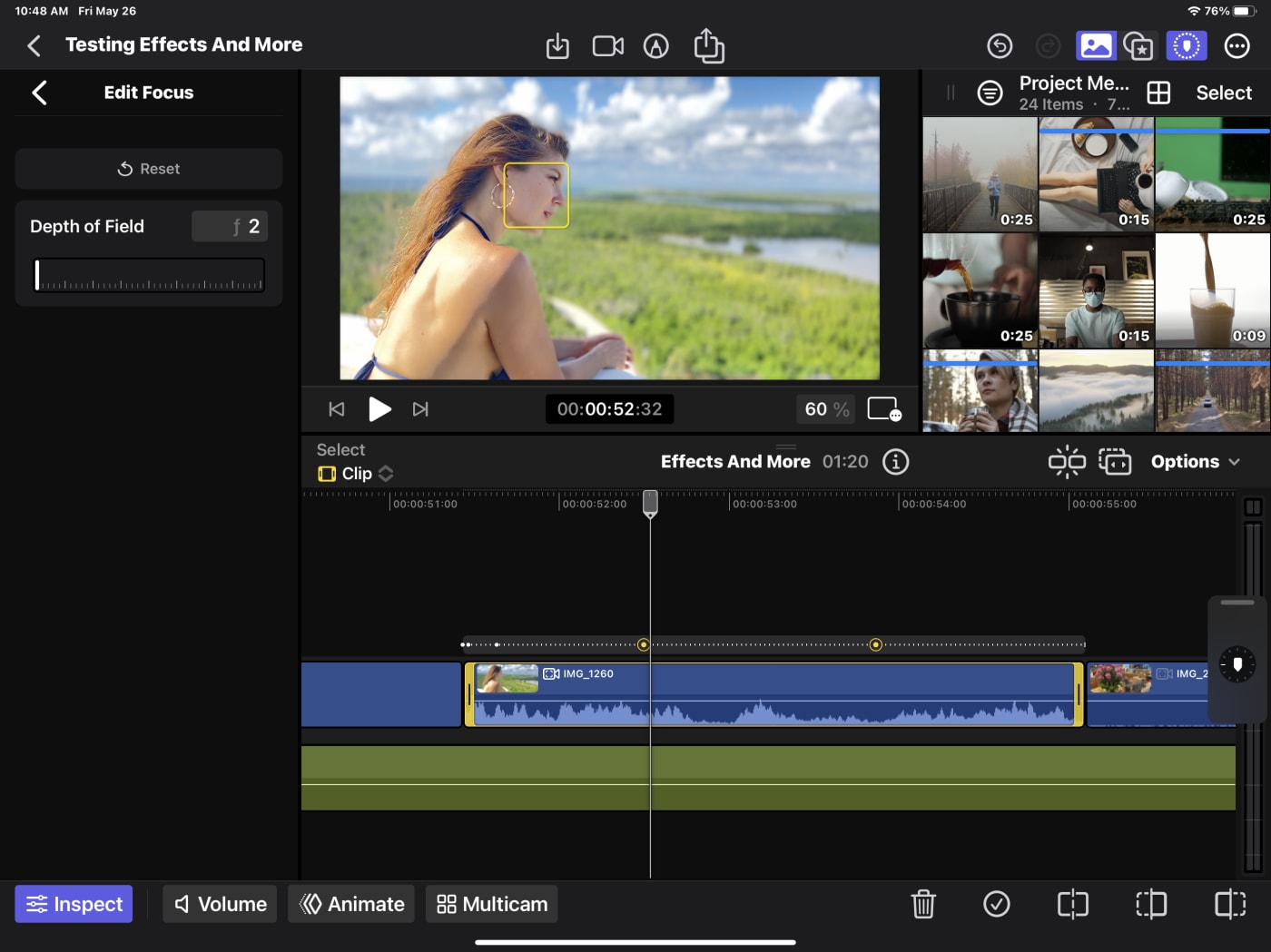
Part of what I think makes a good editor (person) is being able to find footage quickly. And the Browser on the iPad feels cluttered. Maybe the idea is that we will only do a little organization on the iPad.
But I want a better way to handle clips and Keywords have always been amazing. It's clunky here on the iPad though. I'd probably struggle with over 40 clips in a project.
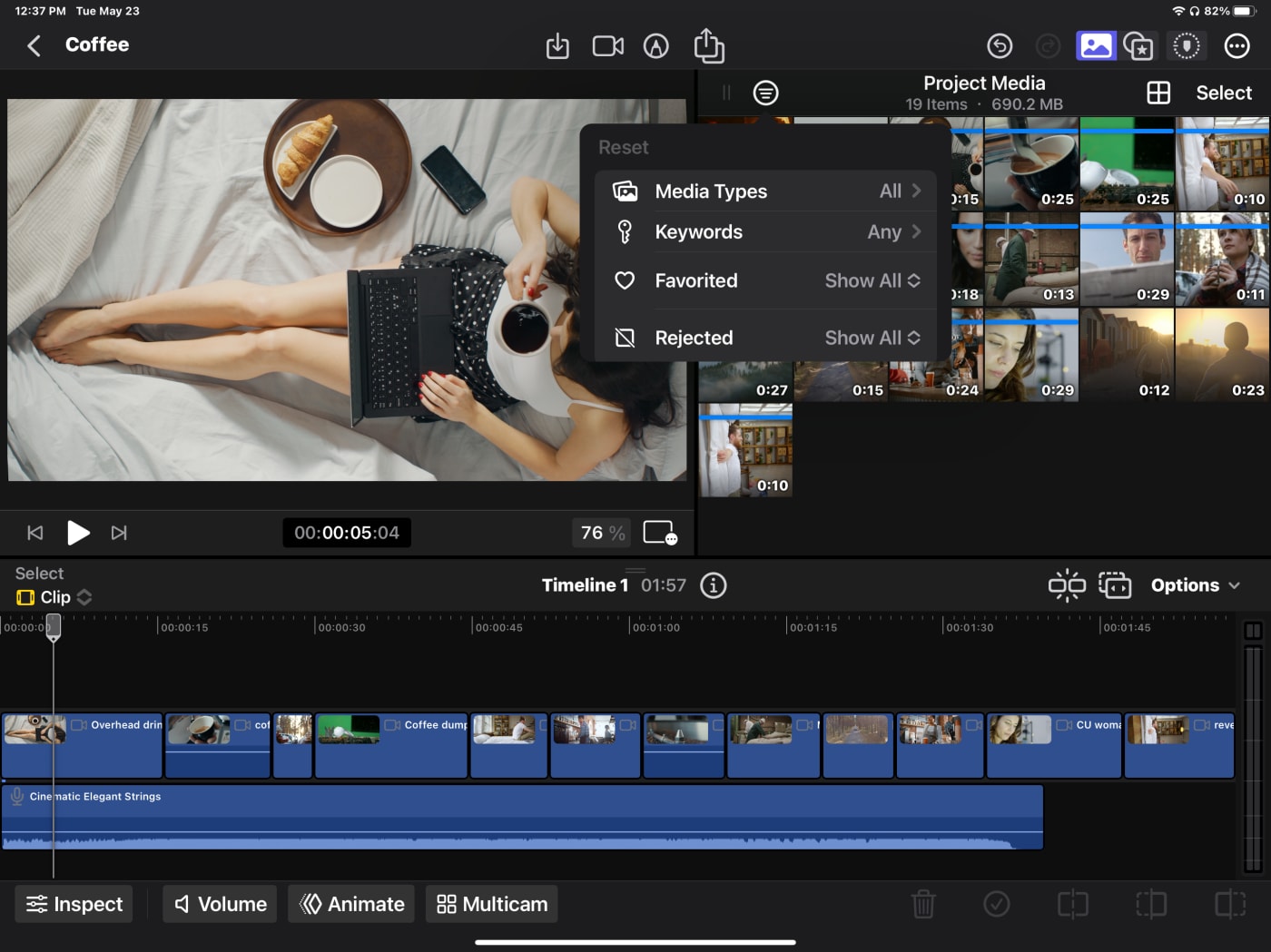
Why oh why isn't there a "Show Unused"? This really made me miss folders and bins. Finding unused footage so I could add it to the one live timeline in a Project? I'm not the first person to want this - and it felt glaringly missing here.
Missing in Action
While there isn't complete parity to the Desktop version, I don't really need that. I do need functionality. Here's a list of things that I feel shouldn't be missing on this release, but are:
- No way to add only video or only audio from a clip. Or to detach one or the other on the timeline.
- Soloing audio―mentioned above.
- Slipping
- One of the basic color correction tools. Or a better Autocorrect.
- The RGB parade. If I get stranded on a desert island, I want this one scope I need. (Along with a Sat-Nav phone.)
- Stabilization
- Background Rendering
- Copy/paste/adjust multiple clips
- Adding clips with a transition
The Subscription―the elephant in the room
Suddenly, Final Cut is Subscription-based. The panic in various forums is palpable. This has been cited for a decade on as to why it's a bargain: you only have to buy it once.
Time for a contrary argument.
$5 to use a tool this powerful on an iPad? That's a bargain. $50 a year? Still a bargain.
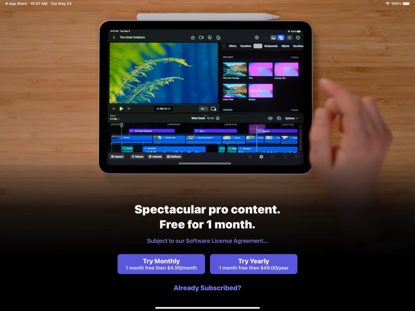
Before you protest, I'm completely aware of the two other tools slated for the professional market (and their price point.) But $5/month is a very interesting test from Apple.
That's 5 years to reach the desktop price. Or never. Or turn it off/on when needed.
I understand the mindset of wanting to purchase something and have it be "one price and done." But even your car needs gas and oil. Right?
If this gets me more features faster, along with New Media/effects/soundtracks? Notice the dialog box says "Spectacular pro content"? Count me in.
Final thoughts
It's not iMovie Pro, but it's not FCP (parity level), either.
It is a very, very functional editor on the iPad.
It doesn't completely nail my dream: to edit wherever I am.
It is a complete studio on a single iPad. From shoot to publish.
Alternatively, with the right workflow, it could be a great getting Projects started faster addition.
It's definitely a one-way trip from Mobile to Desktop.
I'd change the name. I'm not too fond of the bulkiness of Final Cut Pro for iPad.
My big hits:
- Seamless integration of touch and keyboard interfaces, providing a versatile editing experience.
- Powerful all-in-one editorial tool for iOS camera/mobile editors.
- Live Drawing feature for easy annotation and highlighting during live events or educational/training videos. But I want more from the Scene Removal (background removal) feature.
- There is no external media today, and I'm betting it comes soon. Maybe at WWDC?
- Docks work and work well to add peripherals.
- Parts of the interface feel cramped, but the Picture in Picture (PIP) view is another way to get more real estate.
- Audio enhancements include voice isolation, noise removal, and loudness leveling for improved audio editing.
For a first release, this is a great step in the right direction for the Final Cut Ecosystem, which takes advantage of Apple's hardware in the best ways.
Other topics you might like
This Race Documentary is a Masterclass in Real-Time Storytelling
Updated on Apr 15, 2025
Photographers are Losing It Over This iPhone Case That Looks—and Shoots—Like a Retro Rangefinder
Updated on Apr 11, 2025
Capture Beautiful Photos With This Free, 3D-Printed, DIY Robotic Panorama Head
Updated on Apr 10, 2025
OWC’s New ThunderBlade X12 Awarded Best Desktop Storage of NAB 2025
Updated on Apr 9, 2025


